Basics of Color Theory in Interior Design
Basics of Color Theory in Interior Design
Color Theory Basics
Color theory can actually get complicated. Believe it or not. Do you remember when you went to college? We spent more than a month studying color theory in just the interior design class we took. There are more than seven shades of the rainbow. There are a lot of websites that provide a clear explanation of the color wheel, but we'll not spend too much time on the definition for you. We're going over this section and assume that you've already learned the basics of the color wheel.
Once you're well-versed in the real colors and the ways they are utilized and paired, let's dive deeper into theories of color. In particular, let's consider the ways color theory affects your interior design decisions.
Designing for Feel Using Color
In designing a room to have an ambiance, one way to decide on a style is by making a certain sense of the final result instead of an aesthetic or design. Color plays a significant role in determining the feeling of the space.
There's a whole field of color theory that is dedicated to the physical effects of color and how it impacts the brain. Without getting into the specifics of each shade, specific warm colors can make you feel lively, friendly, or even in love. Other colors can inspire peace, sadness, or focus. When used correctly, you can get the mood you want for your space with practically any design style.
After we've examined a little bit of basic concepts of color and the reasons it's so important to think about it, let's take a look and understand what it means in interior design.
Light versus Dark
A lot of upscale eateries are darkly lit, vibrantly colored, and provide a "darker" more cozy atmosphere. In-and-out eateries, fast food restaurants, and lunchtime eateries tend to be more on the light aspect, airier, and open plan. The guests are relaxed, but perhaps not looking to stay for a long time.
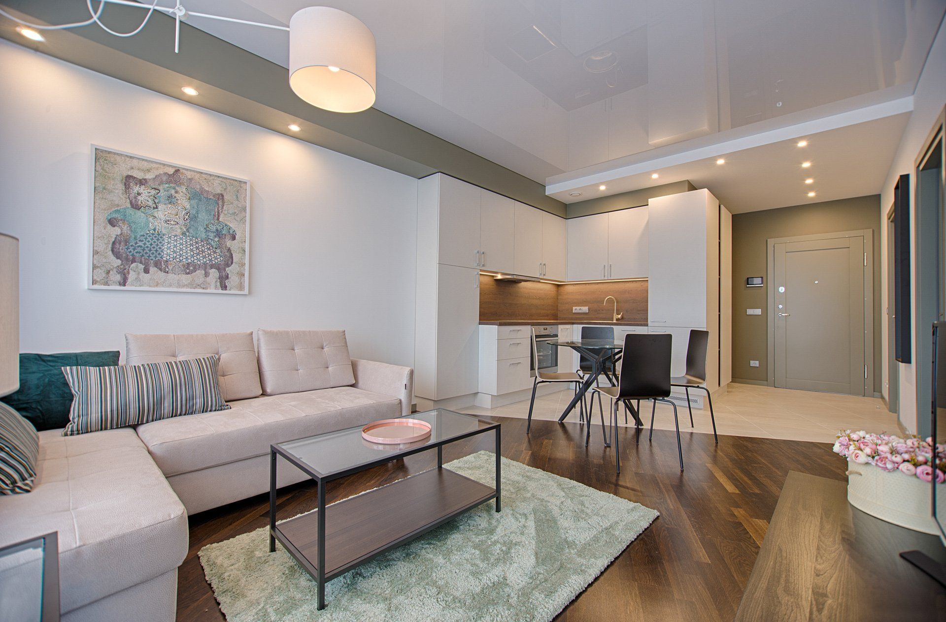
It's not only the restaurants that make use of this. There's a major trend toward white in contemporary interiors for residential spaces as well. Imagine this: any color, even white walls, the color could make a room appear cluttered. But, because of all of the light neutral shades and mostly white, the space appears spacious even though it's stuffed. The designer should use contrast well.
Warm versus Cool
We don't know if any of you were aware of this, but nearly every movie theater that is commercial has red seats. (If you can think of one that doesn't have red seats, congratulations! You've discovered a unicorn! Go buy tickets for the lotto!)
This is not a coincidence. A big corporate interior designer conducted some A/B tests a long time back we're sure and found that moviegoers respond more favorably to rooms with warmer decor. Because they already dimmed the lights in the theater, opting for a dark to create a warm atmosphere wasn't going to be a good idea. They decided to go for a warmer
GET A FREE QUOTE
Send us your details and we’ll get back to you to schedule a time to talk.
Edmonton Interior Design Quote
